Table of Contents
Introduction: The Hidden Power of Color in 2025
In 2025, color has evolved from a mere aesthetic choice to a strategic psychological tool. It shapes consumer behavior, enhances productivity, supports emotional well-being, and drives decision-making across branding, therapy, design, and education. Whether it’s the calming blue of a mental health app or the high-energy red of a fast-food chain, color communicates without saying a word. This article explores the latest science, strategies, and real-world applications of color psychology—uncovering how color affects mood, behavior, and perception in a digitally-driven world.
What Is Color Psychology? (color psychology meaning)
Color psychology is the study of how colors influence human emotions and behaviors. It combines cognitive science, behavioral psychology, and neurobiology to explain how different hues impact decision-making, perception, memory, and even physical reactions.
Historical Background of Color Psychology
From ancient Egyptian healing temples to Carl Jung’s work on symbolism, the psychological effects of color have long been recognized. Early civilizations associated specific colors with healing, power, and spirituality—many of which still hold relevance today.
Science Behind Color Perception and Emotions
Color perception occurs in the brain’s visual cortex and is deeply connected to emotional processing centers like the amygdala. Studies using fMRI scans reveal that certain colors stimulate specific brain activity. For example, red activates areas related to urgency and attention, while green is linked with balance and restoration.
You may also like:
The Evolution of Online Education in 2025
How Colors Affect Mood and Behavior in 2025
Color psychology is now applied in digital experiences, interior design, mental health, advertising, and education. Understanding how colors affect human emotions is crucial to leveraging them effectively.
As noted by Verywell Mind, specific colors can evoke emotional responses such as calm, alertness, or even aggression—depending on the hue and context.
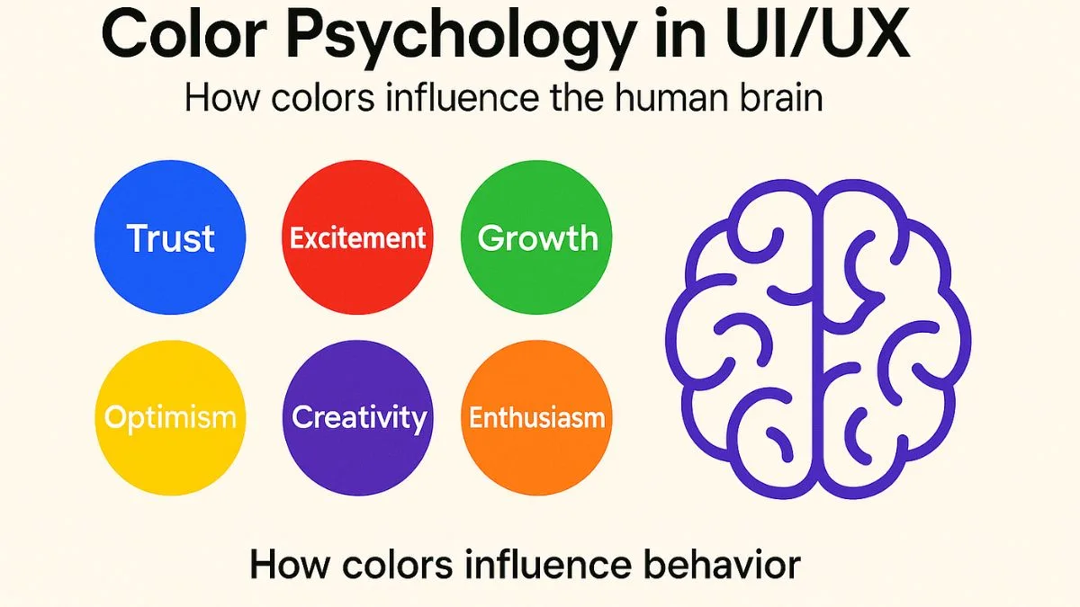
The Psychological Influence of Warm Colors
Warm colors like red, orange, and yellow are associated with energy, passion, and warmth. They stimulate appetite, increase alertness, and evoke strong emotions.
- Red: urgency, power, love, aggression
- Orange: enthusiasm, creativity, warmth
- Yellow: optimism, clarity, caution
These colors are often used in marketing to grab attention and spark quick decisions.
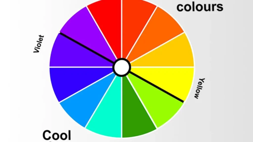
The Emotional Response to Cool Colors
Cool colors such as blue, green, and purple promote calmness, focus, and relaxation.
- Blue: trust, serenity, intelligence (used by tech brands and healthcare)
- Green: balance, renewal, safety (commonly used in eco brands and wellness)
- Purple: luxury, spirituality, mystery (favored by beauty and meditation apps)
Colors for Mental Health and Focus
In therapy rooms, classrooms, and home offices, color is being used strategically.
- Soft greens and blues reduce stress and anxiety.
- Muted neutrals enhance focus without overstimulating.
- Avoiding overstimulating reds is key to calming environments.
Color Symbolism and Cultural Differences (color symbolism psychology)
Colors hold different meanings across cultures and contexts. Misusing colors in global branding or content can lead to misinterpretation.
Red in the West vs. East: Power or Danger?
- In the West, red symbolizes urgency, danger, and passion.
- In China, it represents prosperity, joy, and celebration.
White, Black, and the Psychology of Neutral Tones
- White: purity in the West; mourning in parts of Asia
- Black: sophistication or evil in Western design; authority in fashion
- Gray: neutrality, maturity, and professionalism
Understanding these cultural dimensions is vital for marketers and UX designers in global markets.
You may also like
5 Ingredients for a Successful Restaurant Opening in 2025
Applications of Color Psychology in Real Life (color theory in design psychology)
In Branding and Marketing
Brands leverage color to shape perception and influence purchase behavior:
- Red (Coca-Cola): urgency and excitement
- Blue (Facebook): trust and reliability
- Green (Spotify): balance and energy
Color contributes up to 80% of brand recognition. The emotional tone set by a brand’s palette affects customer loyalty.
According to a peer-reviewed study published by NCBI, color significantly influences consumer perception and emotional engagement—often determining brand trust within milliseconds.
In Education and Learning Environments
- Blue and green classrooms enhance focus and memory retention.
- Yellow elements boost creativity in art studios.
- Color coding improves learning in neurodiverse students.
In Healthcare and Therapy Settings
- Calming tones are used in psychiatric clinics and therapy rooms.
- Color lighting (chromotherapy) supports mood regulation.
These uses are backed by peer-reviewed research and therapist-approved practices.
You may also like:
Best Study Tips for Students: Unlocking Academic Success
Color Psychology in Digital Design and UX in 2025
In an era of overstimulation, color choice in digital environments affects usability, accessibility, and emotional connection.
Choosing CTA Colors That Convert
- Red CTAs work best for urgent offers.
- Green CTAs improve conversion in wellness and eco apps.
- Contrast matters: button color must stand out from the background.
Accessibility and Color Perception for All Users
Designers now prioritize color contrast, text readability, and color-blind-friendly palettes.
- Avoid color-only cues (e.g., green = good, red = bad)
- Use tools like WCAG Contrast Checker for compliance
Color psychology enhances user experience when backed by an inclusive, research-driven design.
FAQs About Color Psychology
1. What is the science behind color psychology?
Color psychology is based on how the brain processes color signals emotionally and physiologically, supported by neuroscience and behavioral research.
2. How do different colors affect the brain?
Colors activate different brain areas—red stimulates alertness, while blue reduces stress and promotes focus.
3. Can color influence buying behavior?
Yes. Studies show that up to 90% of purchasing decisions are based on color alone, especially during first impressions.
4. What is the most calming color in psychology?
Blue is widely considered the most calming color, often used in therapy, hospitals, and meditation apps.
5. How can I use color psychology in my work or home?
Use warm tones for energy, cool tones for calm, and neutrals for balance. Align your environment with your goals using proven color strategies.
Final Thoughts: Why Color Psychology Matters More Than Ever
Color is not just about beauty—it’s about behavior. From branding to healthcare to education, color psychology is being strategically applied to influence mood, decisions, and memory. In 2025, creators, marketers, therapists, and educators who understand color will create deeper emotional impact, better outcomes, and more meaningful engagement.